Color schemes and interior
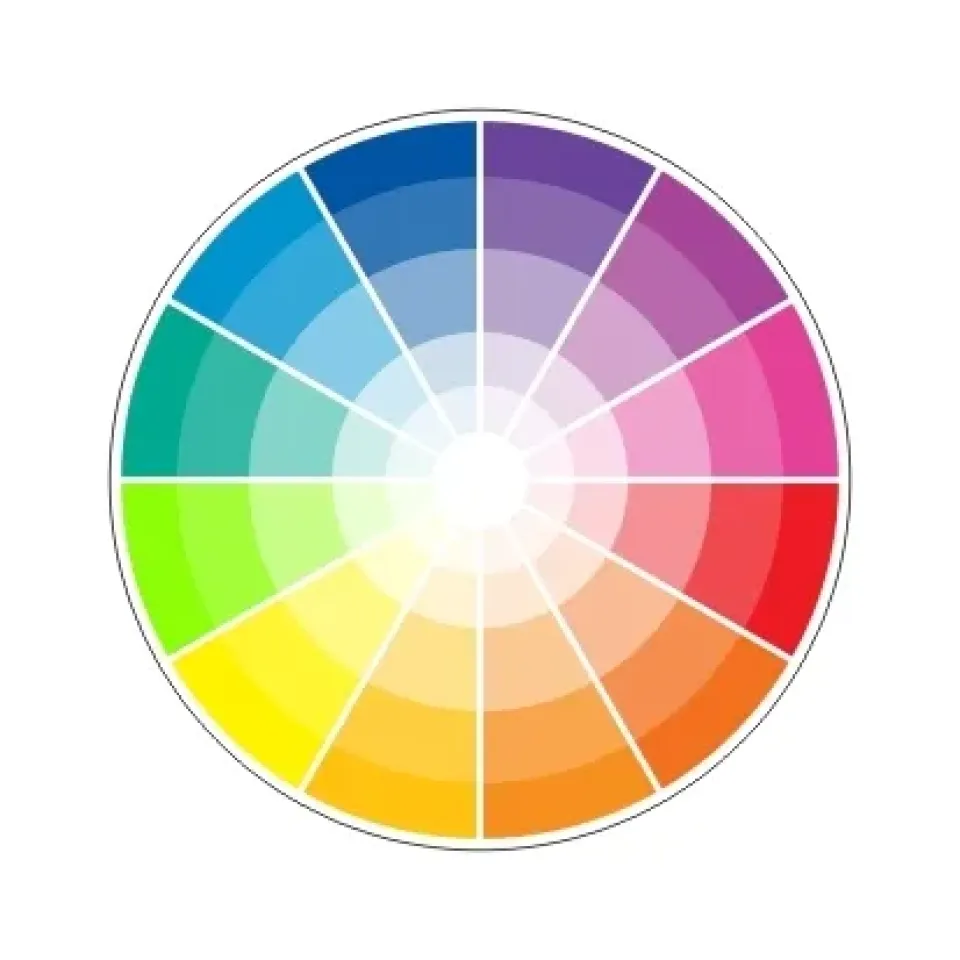
When choosing colors for an interior, designers use special color schemes. There are various color schemes that are based on the color wheel (consists of 12 colors, their darker (lighter) and more (less) saturated shades), and combine colors according to the principle of affinity or contrast. In addition, in the interior, the mutual arrangement of colors and their quantitative ratio, as well as the degree of their purity and brightness, are of great importance. It is also important to know the psychological meaning of all the colors included in it when choosing a color scheme.
The following types of color schemes are distinguished:
1. Achromatic.
It uses black, white and all shades of gray in the "transition" from white to black. According to the laws of color harmony, these colors are universal and combine perfectly with all chromatic colors.
2. Monochromatic.
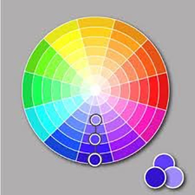
In it, the color scheme varies within one basic color, which becomes darker or lighter, more or less saturated. For example, dark blue, blue, light blue.
3. Harmonious (analogous, similar).
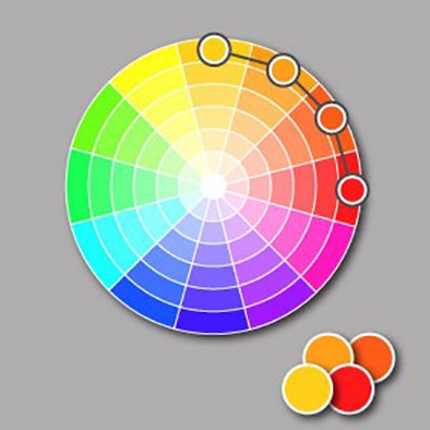
The scheme uses colors that are located next to each other on the color wheel (for example, yellow, orange and red). In such a scheme, one color is used as the main color, and the others as auxiliary. But in such a scheme, you should not use colors that are located too close to each other on the wheel, because the difference between them “cuts the eye”. In this scheme, colors located a quarter of a circle apart contrast best with each other. And one more rule: two warm or two cold colors are better combined with each other than a warm color with a cold one.
4. Contrasting.
The scheme consists of two colors located opposite each other on the color wheel. For example, blue and orange. The scheme is often used to create accents (one main color is bright in a small amount, the second is a dim cold background, or vice versa). This scheme is very eye-catching, but it is more difficult to achieve color balance in it than in a monochromatic or analogous one, especially if soft, warm shades are used, because directly opposite colors do not always form harmonious pairs and often seem too dissimilar.
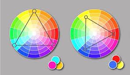
5. Separate contrasting.
It differs from a contrasting scheme in that it is possible to vary the tone of opposite colors in the same way as in a harmonious color scheme. This scheme is also called the "harmony of an isosceles triangle" (because in the event of any rotation of this triangle in the color wheel, three colors that harmonize with each other will lie at its vertices.) It can use all three colors, or only the colors from one of the equal sides of the triangle. The main element can be either one color or two opposite to it. This scheme offers more possibilities and is perceived less tensely than a contrasting one. However, it is not always possible to choose colors that are combined with each other (in the case of using only one of the equal sides of the triangle.) In such a scheme, it is better to use one warm color against a range of cold colors (for example, warm yellow against shades of blue-violet).
6. "Rectangle" scheme (double contrast).
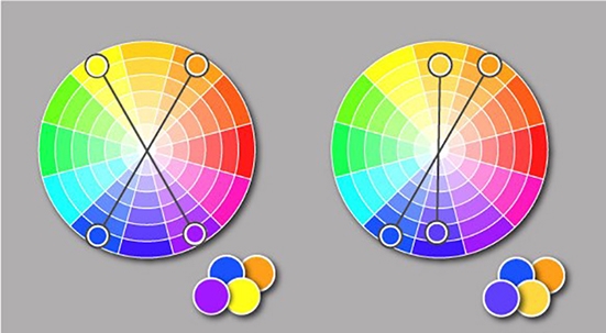
Four colors are used here - two pairs of opposite (contrasting) colors. In such a scheme, it is difficult to achieve harmony if all four colors are used in the composition in equal proportions. However, such colors can be used for details on a general black or white background.
7. “Square”.
The scheme is similar to the “rectangle” scheme, but in it the four colors are evenly spaced along the color wheel (“square”).
8. The “triad colors” scheme.
The scheme uses three colors equidistant from each other on the color wheel (according to the principle of an “equilateral triangle”). “Triads” are divided into: “primary” (based on basic colors), where yellow can be replaced with white, gray, gold; “secondary” (based on secondary colors) - more refined and professional; “tertiary” (2 variations of tertiary colors), which allows you to create unusual color combinations. This scheme provides strong visual contrast, while maintaining balance and color saturation. All of the schemes listed above can be used in different variations of color wheels, for example, in a circle with neutral colors.
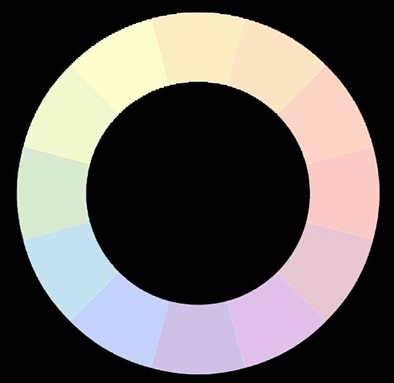
These are the following colors: ivory, shades of beige, light brown, milky, etc. They create the effect of elegance, lightness, sophistication and nobility.